Interview with JKR’s Chief Creative Officer: "Brand design is an obvious thing" | Notes
Author: Chain
In the fast-paced Internet era, the change of design trends has become more frequent. In the rapidly changing "fashion", should we follow the trend or "resist the temptation"?Why do some brands, no matter how the tide of the times changes, do not lose their own unique characteristics in continuous innovation?
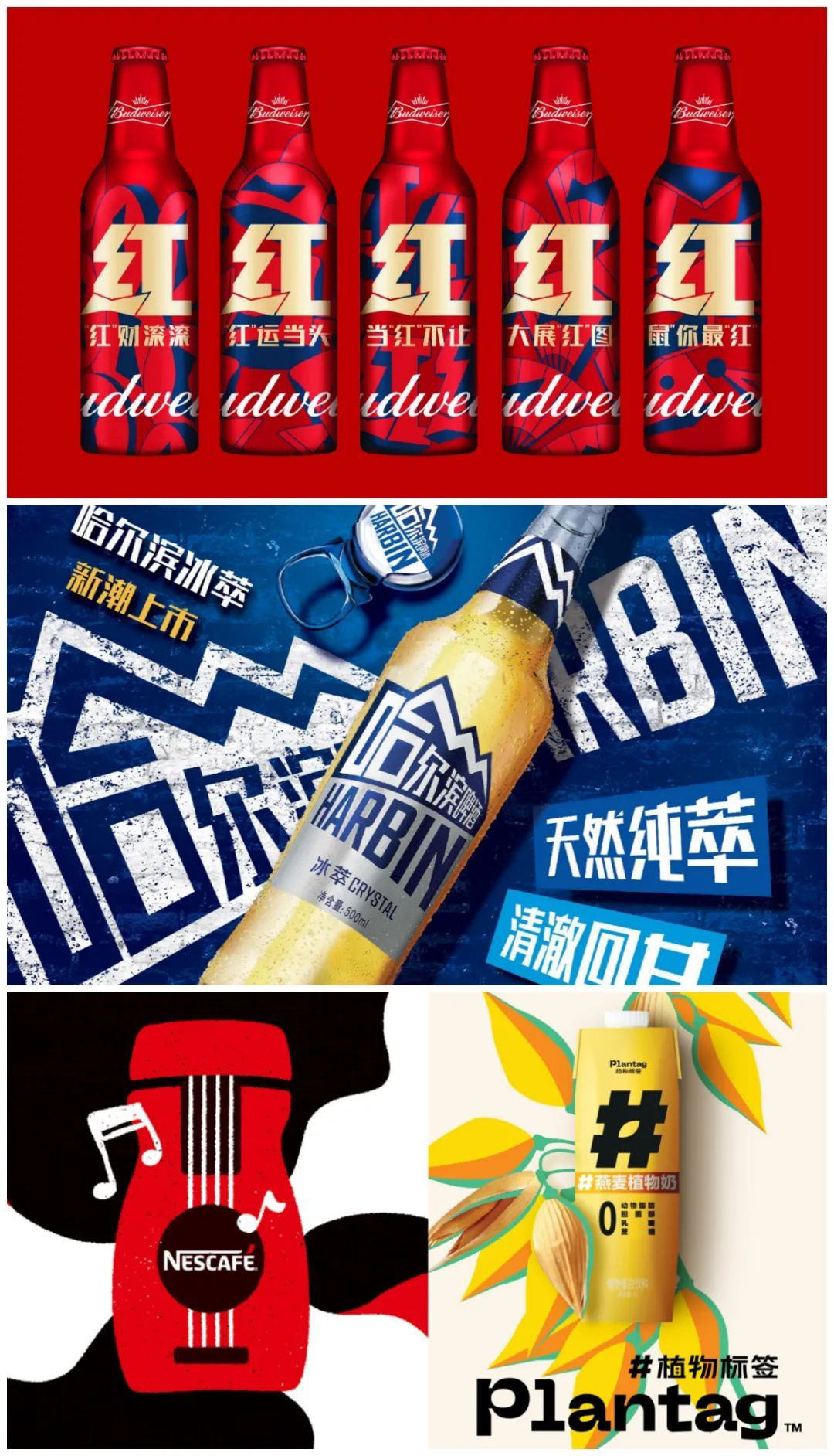
JKR design works
Image source: JKR
The brand design made by internationally renowned brand design company Jones Knowles Ritchie (JKR) is distinctive and natural, and it is a long-term partner favored by many international brands. In the process of innovation with design creativity as the core, JKR can often be keenly aware of the core key assets of the brand, and on this basis, make appropriate and unconventional design works.
René Chen, the chief creative officer and founder of JKR Shanghai, has nearly 20 years of brand strategy and creative design experience in serving global iconic brands such as Mars, Budweiser, Pepsi, Starbucks and Nestle, and was named one of the most noteworthy women in Greater China in 2022 by Campaign magazine.
René Chen, Chief Creative Officer & Founder of JKR Shanghai
Image source: JKR
We chatted with René, and in this article, we shared her valuable experience and understanding in the process of brand design, mainly including the following cases:
Helping for six consecutive yearsBudweiserSpring Festival marketing, and dominate the Spring Festival beer list in 2022"Hongyun Bottle";
Adapting to the "light social" needs of young people in China and adjusting brand strategyBaiwei xinlan;
Get rid of the traditional impression and reshape the young style.Harbin Beer;
Capture the core assets of the brand and make it clear at a glance.Nestle chunpin coffee;
Establish a unique design language and create a different China plant-based food.Plant label.
01
How does Budweiser Hongyun Bottle dominate the Spring Festival list?
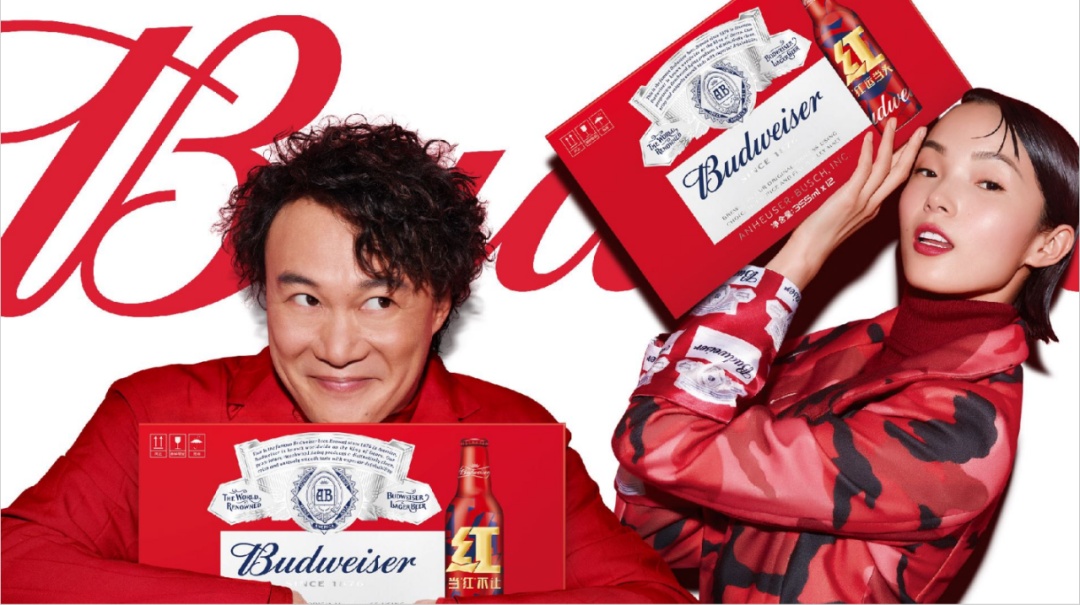
Image source: JKR
Budweiser, with a long history of more than 140 years, is one of the best-selling beer brands in the world.
Since it officially entered the China market in 1995, Budweiser has established a distinctive brand position of "King of Beer" with its pursuit of quality. Brand hopeFurther deepen brand equityAt the same time, it can alsoChina Spring Festival CultureCombined, in the Spring Festival, the peak season of beer sales, we got a good result of "full door red".
In 2017, JKR began to design a limited version of the Spring Festival for Budweiser; Three years ago, the two sides further deepened their cooperation. JKR, as the designer of brand strategy, led Budweiser Red’s Spring Festival marketing campaign for the first time with a leading role, and won many battles.
During the Spring Festival in 2022, after the limited edition of Hongyun Bottle was launched in JD.COM,It was sold out in just one hour. As an important traffic engine, it helped Budweiser become the TOP1 beer sales list in JD.COM..
JKR’s Spring Festival limited edition designed for Budweiser beer in six years.
Image source: JKR
1. How to create a "red" exclusively for Budweiser?
Note: It is not difficult to find that the design of Hongyun bottle has changed greatly in the past six years, especially after 2020. What is the reason for this change?
René: Spring Festival is a very important peak season for beer category. Our duty is to help Budweiser, an international brand, find one.standpointEstablish contact with the Lunar New Year, send blessings to consumers, and enhance the brand’s influence and sales.
In 2020, our cooperation with Budweiser will be upgraded by leaps and bounds. Generally speaking, as a design company, we will not participate until the whole activity plan is basically confirmed. However, based on the success of limited packaging cooperation in the Spring Festival of 2017-2019 and the accumulated trust, in 2020, Budweiser entrusted us to play a leading role in the lead agency and deeply participated in the marketing activities of "Budweiser wants you to be red".
That is to say, packaging design has become the dominant and core, leading all related marketing communication.
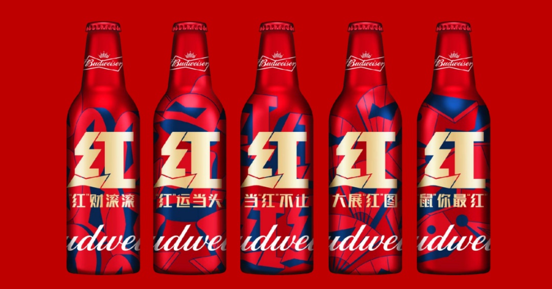
2020 Budweiser Hongyun Bottle
Image source: JKR
As a leading role, weThe word "red" is creatively designed, and the classic bow logo of Budweiser is integrated into the word "red" which symbolizes good luck, turning it into a special "red" belonging to Budweiser.. This unique visual symbol gives Budweiser a brand asset that can be used continuously, which greatly improves the whole marketing effect.
Note: There are many ways for brands to express the atmosphere of the Spring Festival. Why did JKR choose the word "red" for Budweiser? How is Budweiser Spring Festival marketing with packaging design as its core different from other brands?
René: Why did you choose the word "red"?
First, "red" itself is an important brand feature of Budweiser.
In the process of pursuing creativity and innovation, we may forget some of the most intuitive things of the brand. We believe that the concept of "red" is something that the brand is born with, and we must do it.
The word "red" not onlyVisualize the impression of Budweiser "red" in everyone’s mind., is a sign of visual shock; It also integrates the theme of Budweiser in the Lunar New Year. Through repeated use every year, it is applied in various contacts, including packaging design, outdoor advertising, TV advertising, brand experience and other activities, which constantly deepens the brand impression in consumers’ minds and produces interaction with the brand.
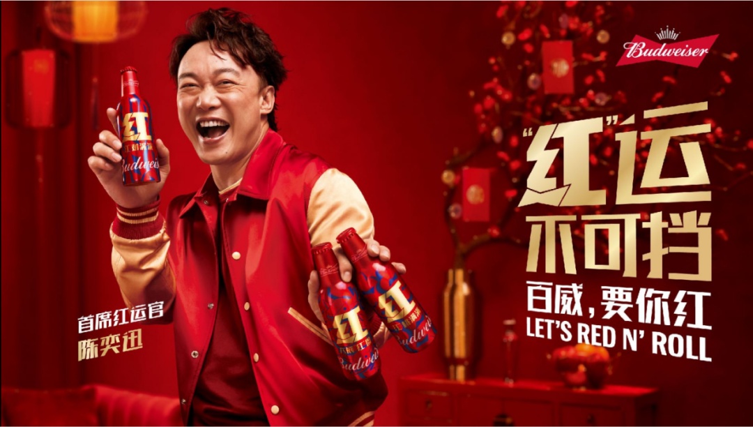
2021 Budweiser Hongyun Bottle Advertising
Image source: JKR
Second, "red" is the most intuitive embodiment of the traditional Spring Festival.
JKR’s working philosophy has always been: we never design for fancy or simply to meet the trend, butAlways start from the most natural point of the brand itself, and then enlarge this point infinitely. Because Budweiser has such brand uniqueness, it can go back to the original.. We enlarge and strengthen the brand uniqueness, and consumers are naturally moved.
Budweiser’s Spring Festival marketing is to do the whole activity from the design point of view, to influence and infect the whole marketing practice. Therefore,Creative-driven marketing activities can get closer contact with culture and have stronger cultural appeal..
Last year, we collected the packaging of many brands during the Spring Festival, and found that some brands’ marketing activities were to collect the word "Fu", while others were to make gift boxes. Budweiser’s marketing activities areTaking creative design as the originNot only when consumers come into contact with it, their impression of the brand is more concentrated and stronger; Its marketing expansion, such as offline activities, flash experience, online red rain, etc., extends from the impression of "red" and is also very natural, and there will be no blunt feeling.
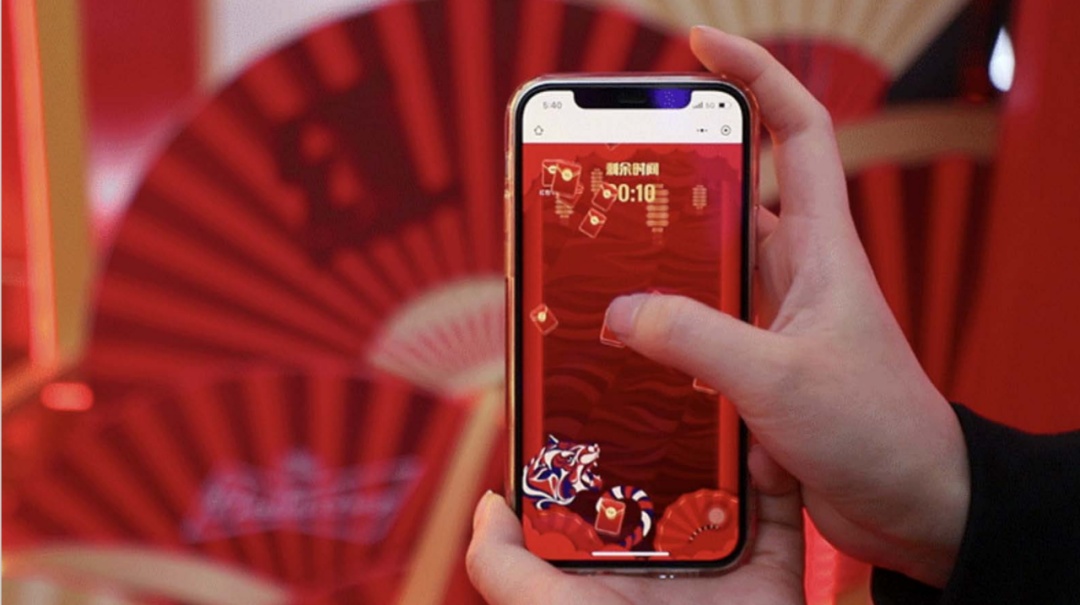
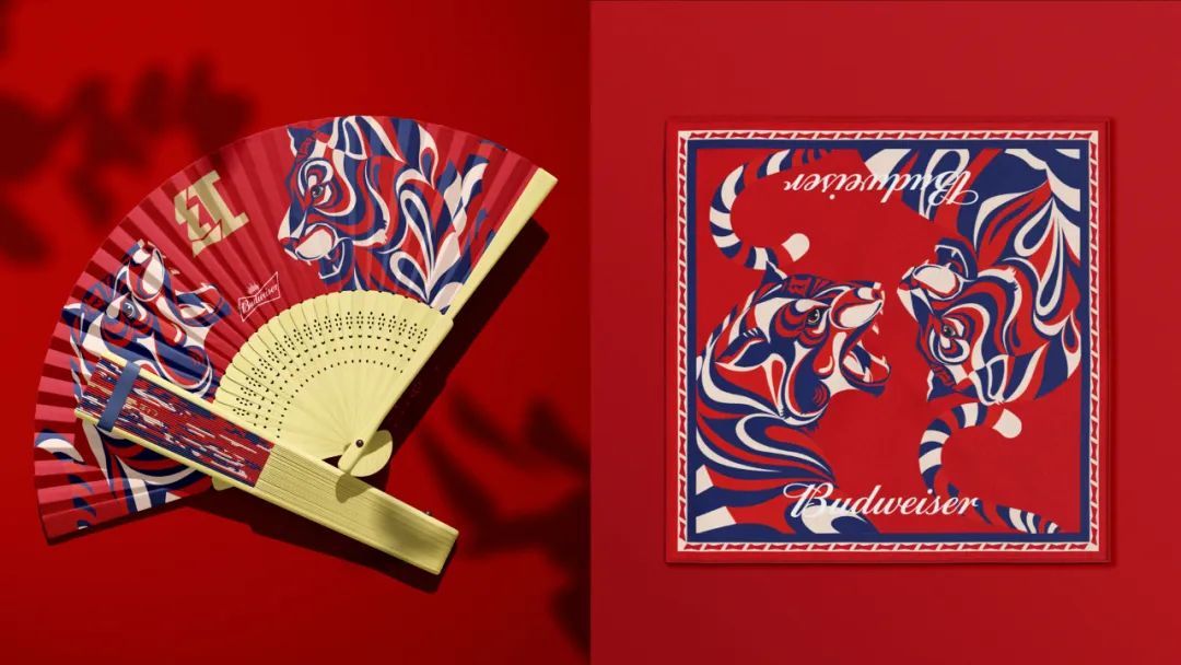
Application of Vision Extension in 2022 Budweiser Year of the Tiger
Image source: Budweiser Beer official Weibo, JKR
Note: Speaking of this, in fact, in 2022, that is, in the Year of the Tiger, the red bottle has changed greatly, and the word "red" in the previous two years is no longer repeated. Why? Will it weaken this sense of series?
René: Through the preparation of the Year of the Rat and the Year of the Ox, Budweiser’s Spring Festival marketing influence is very extensive, and the word "red" has been deeply rooted in people’s hearts.This year, we believe that the interpretation of "red" should bring freshness to everyone and can be presented differently.. Here, "red" is no longer a simple word "red", it can be displayed in a more flexible way in packaging.
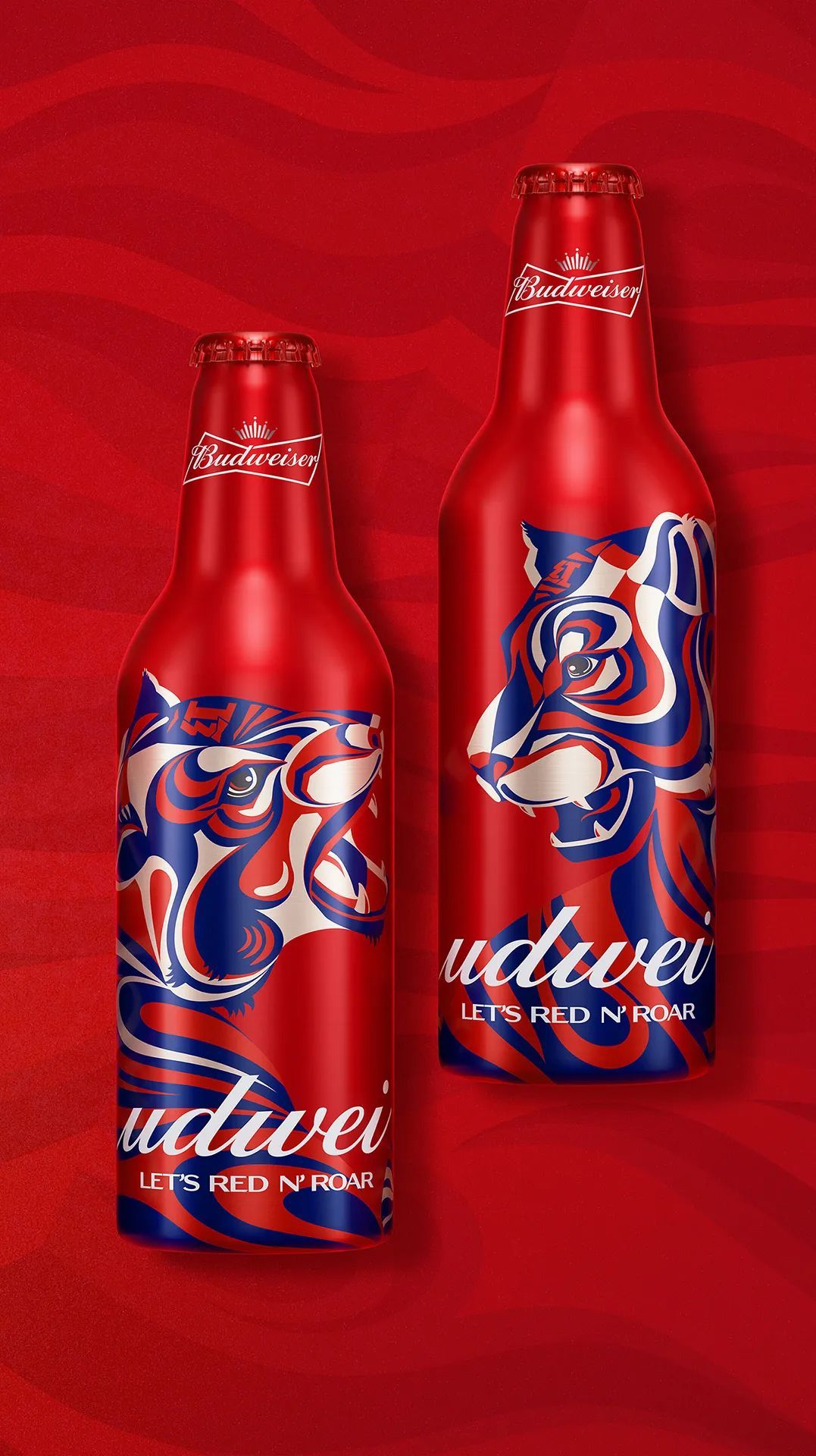
2022 Budweiser Hongyun Bottle
Image source: JKR
In addition, for Budweiser, the Year of the Tiger is very special.Budweiser brand is known as "King of Beer", and Tiger is also known as "King of Animals".The combination of the two is also the opportunity we have been waiting for.
We make great efforts to enlarge the image of the tiger, which adds a special feeling to the Hongyun bottle. At the same time, the image of the tiger will be extended to more product lines, not only red Budweiser, but also Budweiser Jinzun, Budweiser Master Zhen Zang and other product lines, which will promote more limited-edition Spring Festival.
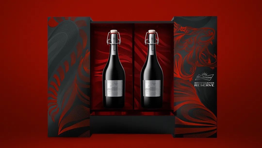
Master Budweiser Zhen Cang
Image source: JKR
2. The "domineering" king turned into a "little fresh" in China?
Note: Budweiser’s Spring Festival marketing of Hongyun Bottle is actually an important attempt for Budweiser to come to China market to integrate local culture. Then, will Budweiser’s brand strategy in China be adjusted compared with that in the United States where it originated? For such an iconic strong brand, how do they judge whether it is necessary to adjust the brand strategy according to the characteristics of the local market?
René: If you are talking about the classic red Budweiser, the overall tonality of Budweiser at home and abroad is relatively consistent.Internationalization, boldness and avantgarde.
No matter when and where, Budweiser King of BeerWangzhefanThis core feeling has not changed, even if the packaging design is updated, it will only make the whole package more concise, intuitive and modern.
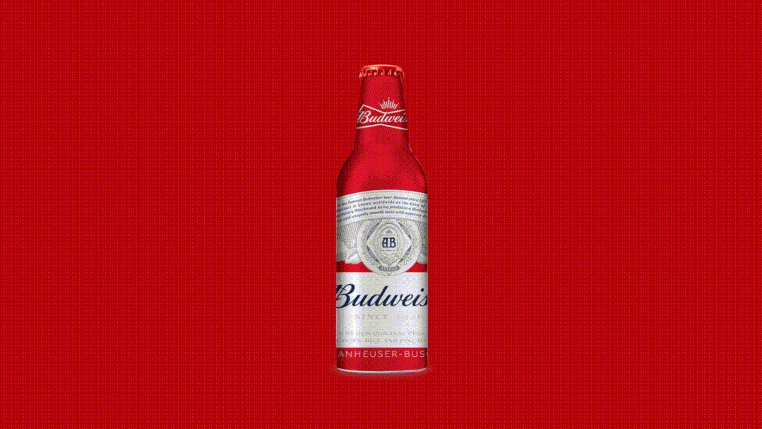
Speaking of strategic adjustment, Bud Light, owned by Budweiser, is a relatively new case for us.
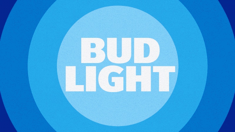
Bud Light- Budweiser Xinlan
Image source: JKR
Bud Light is a low-alcohol and light wine. Therefore, we gave it a Chinese name "Baiwei xinlan”。
In the United States, Bud Light is a very well-known brand. In the brand list, Budlight competes with Budweiser for the top position all the year round, and it is a flagship Volkswagen brand.
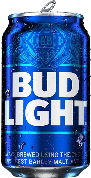
Bud Light packaging in the United States
Image source: Bud Light official website
In 2020, when Bud Light was ready to enter the China market, based on the investigation of China market and target consumers, it made some adjustments to its brand positioning, hoping to go.Young and high-endThe route. Therefore, we need to make some adjustments to Bud Light’s original brand image so that consumers can accept some premium.
This project starts with strategy. After investigation, we found that the demand of domestic young consumers for light beer is mainly concentrated in social occasions, but there are some differences compared with the scenes of swigging beer and getting drunk. We define these social occasions as "superficial social interecourse”。
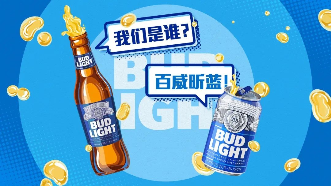
Baiwei xinlan
Image source: JKR
Light socializing may be script killing, playing games, community gatherings, etc., some occasions that require creativity and imagination and are not suitable for getting drunk.Drinking a glass or two of light beer will make everyone feel a little tipsy, and then it will be easier to communicate and play together. This "light social" positioning is very different from Bud Light in the United States.
So, we used some illustrations to emphasize "pure and freshThe feeling of "Bud Light" makes its whole color tone very light, which will not give people a burden, but at the same time it will not completely cover up Budlight’s original cool design sense.
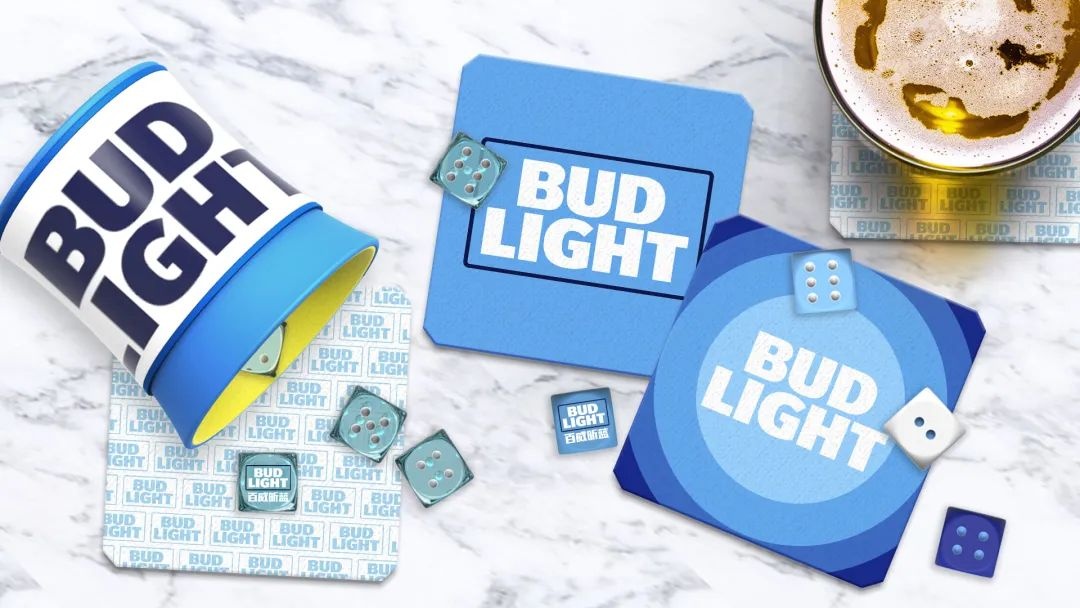
Baiwei xinlan periphery
Image source: JKR
Generally speaking, Budweiser has entered the China market for a long time, and its kingly demeanor is deeply rooted in people’s hearts, so its strategy in China has not changed much. Budweiser Xinlan, on the other hand, needs to make its brand image better adapt to the new positioning of China market, especially the special social needs of young consumers in China today. Therefore, it needs to adjust its brand strategy to better suit the situation in China market.
So, do you need to adjust your strategy in different markets?We should analyze according to the current situation, see where the brand is, and then adapt to the possible positioning..
02
Harbin Beer, the "Burst and Rebirth" of the iconic Snow Mountain
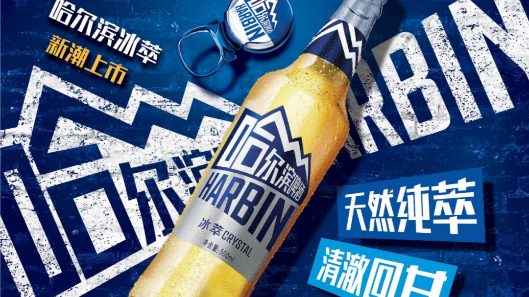
New Brand Image of Harbin Beer
Image source: JKR
Harbin Beer, founded in 1900, is the earliest beer brand in China. In 2004, Harbin Beer was acquired by AB-InBev, the parent company of Budweiser, and gradually marketed in the wider British and American markets.
If Budweiser Red’s Spring Festival marketing "Lucky Bottle" is based on the brand’s own red attributes and kingly demeanor, it greatly retains the brand’s core characteristics and takes advantage of the innovation, thus being natural; Then the rebranding of Harbin Beer is more explosive, which can be said to subvert the traditional image.
At first glance, it seems that the young and modern design trend has the upper hand, but the seemingly subversive design not only does not make people feel stiff, but helps the brand become the best-selling product in the beer market segment.Only six months after the rebranding, it has generated a total influence of 440 million online and offline.. Behind such obvious trade-offs, how do designers think?
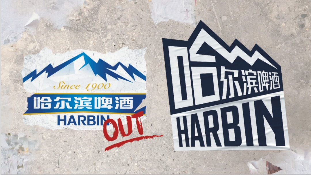
Comparison of Harbin beer brand image before and after
Image source: JKR
Note: In the case of Harbin Beer brand rebranding,We can clearly feel a division from the traditional image.The original Harbin beer gives people a strong impression of tradition and orthodoxy, including the design, color and structure of the wine label, which reflects the orthodoxy of this manufacturer.
The design of new brand image, applied to the packaging of ice extraction products, has obviously changed a lot. So, the first thing I’m curious about is,Will the new brand image be gradually applied to other products?Or will the old and new brand images go hand in hand?
René:The case of Harbin Beer is a very rare case for me.It is also a case that makes us very passionate. Harbin Beer has many different product lines. At first, the new logo was mainly used in the packaging of the ice extraction products you mentioned, but the new visual image represents the brand image of Harbin Beer and has also appeared in many different occasions. For example, you see that it represents the brand Harbin Beer in Fashion Week, not a specific product line.
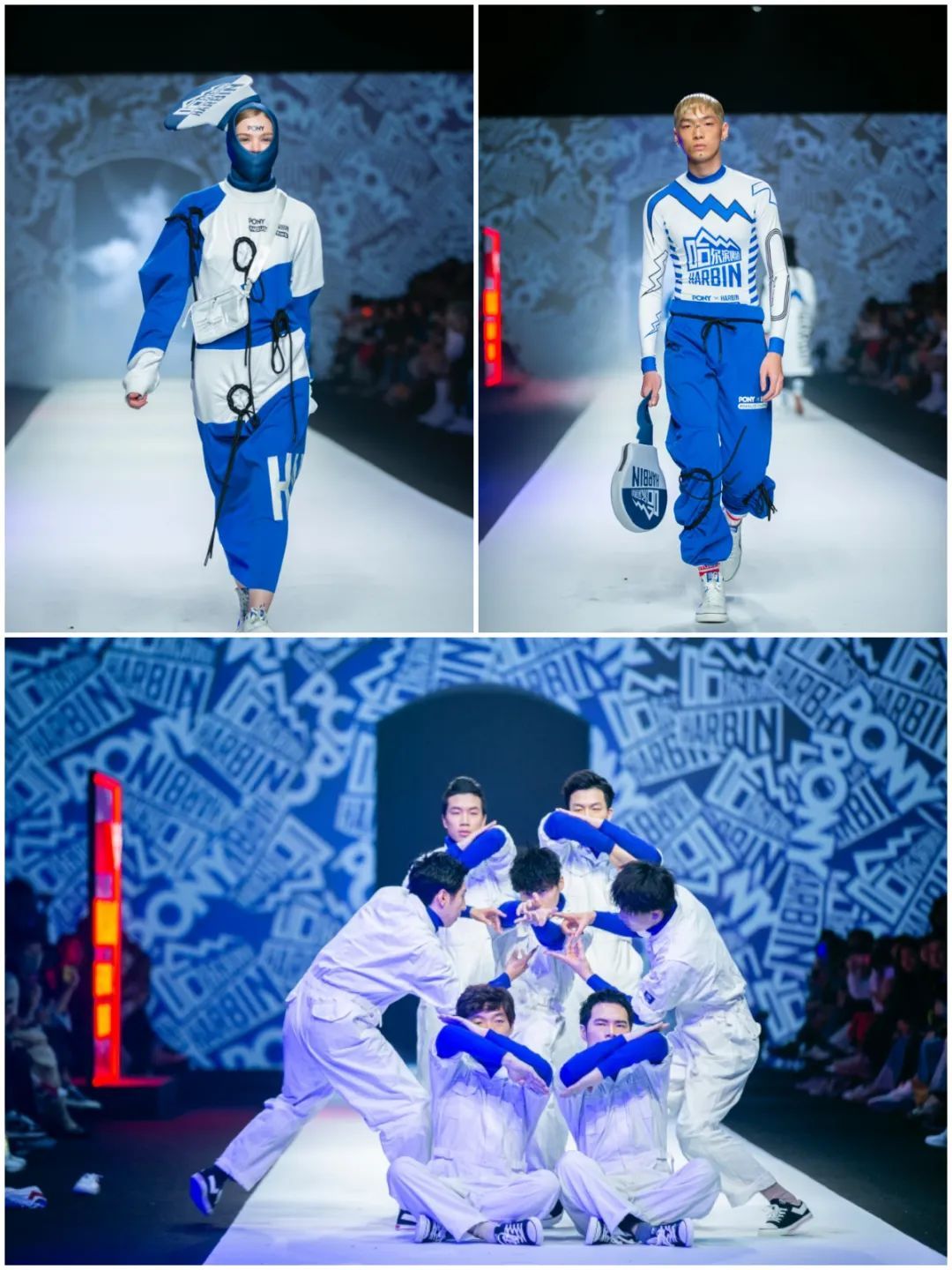
The Extended Application of Harbin Beer Brand Image in Fashion Week
Image source: Budweiser official website
Therefore, it must be a change of the brand as a whole, not just used in ice extraction. As for how to apply it to other product lines, it may take time to step by step.
1. Harbin features "street style"
Note: the original logo feels peaceful and atmospheric, especially the golden strokes on the wine label, which has a sense of orthodoxy. The new logo uses a combination of far and near radioactive fonts, and only uses blue and white colors to highlight the sense of rhythm and bursting, both of which have their own advantages.In the process of designing a new brand image, how to choose the characteristics of the original brand?
René: Basically, in the whole process, of course, we should highlight the high points and also precipitate and inherit the important features of its brand image.Snow mountain is one of the important points.. At that time, I did a lot of research and asked everyone, what do you remember about Harbin beer? Everyone has a little impression, that is, its snow mountain logo.
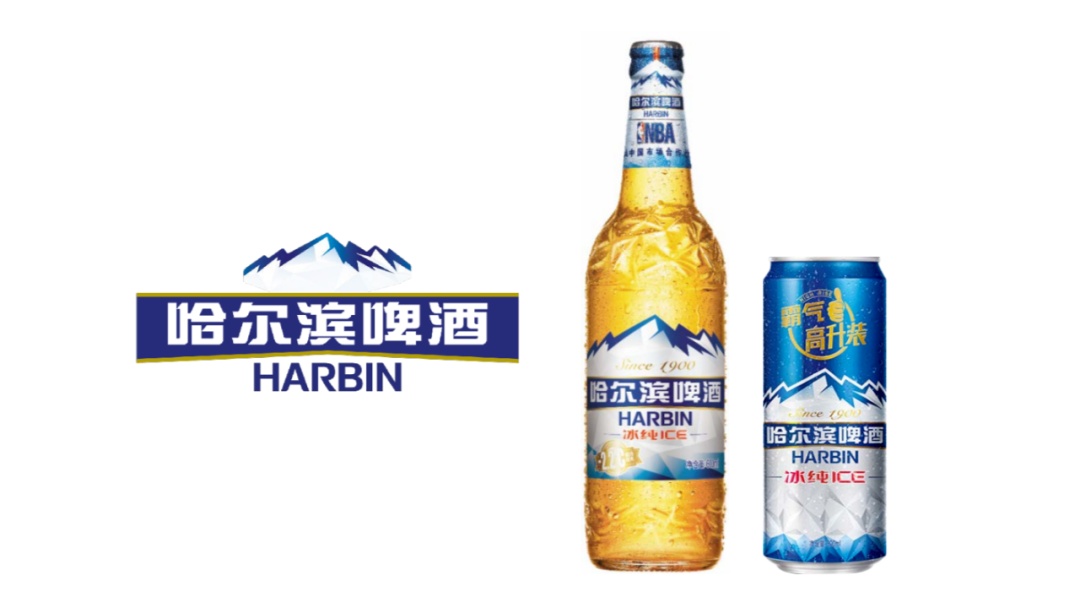
Original brand image of Harbin beer
Image source: JKR
Therefore, we will lock in this point and express it in more modern language to make it more in line with young aesthetics. Harbin beer hasn’t changed much in the past. It is a very "positive" brand, but it also lacks appeal to modern young people.
So our new design,It must be cool and bold,It should reflect the impromptu and very excited mentality of a new generation of young people.
In terms of specific strategies, we have locked inJietou elementBecause it fits perfectly.Harbin is a city that likes to taste new features..
Some people may say, will street culture not have the characteristics of China, which is far from the characteristics of Harbin Beer itself? In fact, the street culture in Harbin is an important attribute of the city. When we went to Harbin, we found a very interesting and unique element in the street.It’s just layers of stickers, including phone numbers, leaflets, and "bang" on the wall, are very street-like.
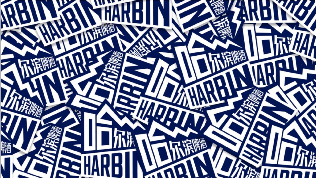
New Brand Image of Harbin Beer
Image source: JKR
What does the brand want to express? A young and unruly attitude, combined with street culture, is a very natural thing with the unique attributes of Harbin city.
If you look through the history of Harbin, you will know that,Harbin beer is the earliest beer brand in China, and it is an innovative beer brand that stands at the forefront of fashion.. Therefore, rather than subverting its traditional image, it is better to help it find its original innovative image of "standing at the forefront".
We only keep the most impressive symbol of the brand and its most important brand asset-Snow Mountain, and then try to integrate into the street trend culture of Harbin to make it more interesting and unique. One of the ingenious places in this design is that it canMelt the words "Harbin beer" into the snow-capped mountains.
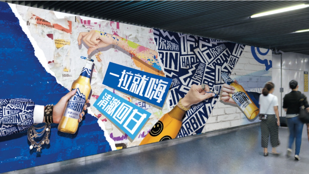
New Brand Image of Harbin Beer
Image source: JKR
It canCombine the logo that was originally divided into upper and lower parts.Let the symbol of Snow Mountain be inseparable from Harbin Beer forever, make the whole inseparable, and make the brand more flexible and easy to use.
Note: but the contrast between the new brand logo and the original logo is very big. Will customers find it a little unacceptable?
René: First of all, it can be revealed that the design you see now is one of the designs in the first draft of our Presentation.
If you ask a customer what they want, he may say, I just want to renew the brand because it hasn’t changed for too long. In the past, the so-called changes were to make this place bigger and there smaller, and there was not much change; But they know that if this continues, they will completely fail to keep up with the development of the trend. Moreover, Harbin beer has been very young in communication, and it is necessary to make some changes in the original classic packaging.
At that time, when we made the first round of design, we actually gave many bold and different choices, hoping to inspire customers to think with us.First, Harbin Beer wants to be rejuvenated and young. Second, what do we really want and how to really rejuvenate Harbin Beer itself.
I also thank the customers for their bravery. They have the spirit of Harbin, are bold, avant-garde and have their own attitude. Therefore, I often tell our team that many good designs, maybe you will find this design very powerful when you see it outside; But in fact, it’s powerful, and many times it’s also because the customer is very powerful, because if the customer doesn’t want to, your case will not exist.
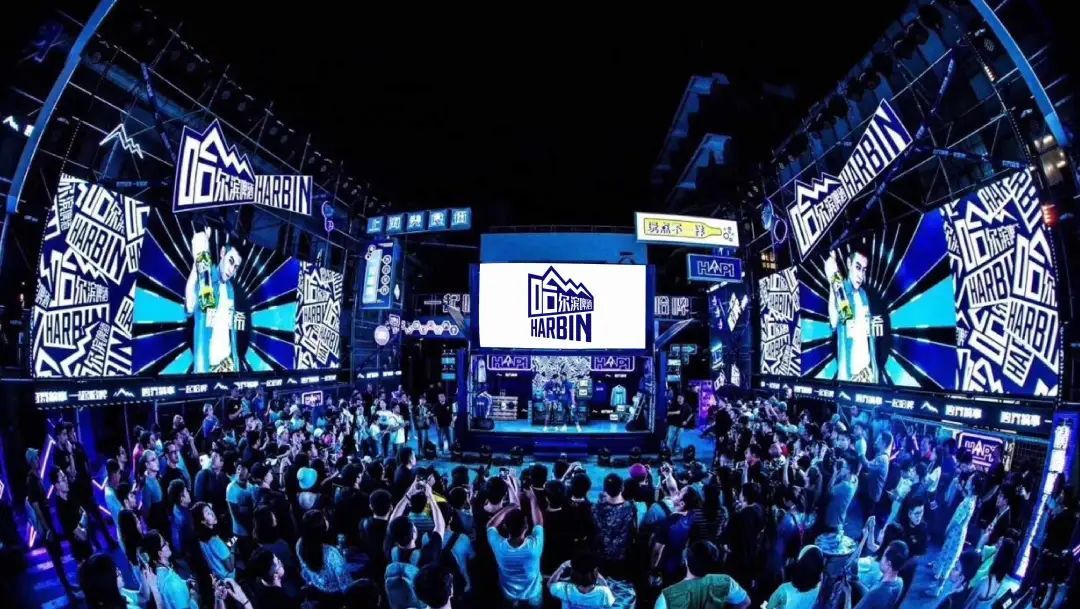
New Brand Image of Harbin Beer
Image source: JKR
2、“The sharper you are, the better you are"
Note: the advantages of this new brand image design are very prominent and have a great visual impact, but there arePeople will also worry about this, whether it will attract young consumers, and at the same time, the brand will lose some consumers who may have older age groups.Will brand customers have similar concerns when deciding to use this design?
René: We often say that brands should think clearly about what they want when they ask for a Brief. It is difficult to pass the proposal if it is both necessary and necessary.
In the case of Harbin Beer, the customerVery clearly want to capture the personality of young people in China.I have been in the industry for many years, and there is a saying called "the sharper you are, the better you are". The design goal must not be everyone, and it is impossible to make an effective design.
Everyone is a habitual animal. This case is newly designed. You want to catch a certain group of people at first, but gradually others get used to it and will buy it if they like.
Note: Looking back on commodities in daily life, from the perspective of consumers, there are indeed many such situations. However, when many brands want to be younger or rejuvenated,One of the major difficulties I encountered was that I understood everything when I talked about ideas and methods, but when I put it into practice in a specific case, I still felt that it would not work either.
René: It’s completely understandable, but it also depends on the situation. For example, if the idea of Budweiser "Red" is directly applied to Harbin Beer, it really won’t work.
But to judge whether it works or not, I believe it is ultimately about intuition. What is intuition in many cases? it’s youIt looks natural and should be like this.. We often sayIntuition is priceless.For example, we have many years of experience in the industry. When we see a brand and customers give us some Brief, we often have the answer in my heart during the listening process. This is actually our intuition. So many times, I take the answer and deduce it in turn.
Set a note:Kind of like a proof question?
René: Yes, it is also the result of accumulated experience. What I have to do is to think about how to push it back, so that everyone can have confidence in this plan, such as what the data is and what it can prove. But many times, the data is easily out of date, especially in the sense of the brand. Maybe today’s data will be wrong tomorrow.
For example, in the famous story, you ask people how to make it faster. If he is riding a horse, he will answer that he wants a faster horse. How can he give you the answer of "car"?Research can’t give you an answer.. Think about it, if you are an audience of consumer research and ask you whether to choose A or B, you think neither is good, but when it asks, you have no choice but to say "A then". Is A the answer? That’s not true.
Therefore, we say that intuition is priceless, including many customers who actually have great intuition, but in the process of entanglement and struggle, we are finally confused, which is a pity.
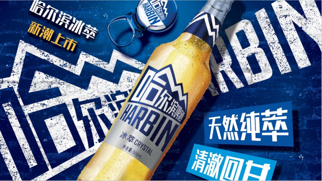
New Brand Image of Harbin Beer
Image source: JKR
3. Is "simplification" and "symbolization" the inevitable result of brand development?
Note: Another point we have observed is that Harbin Beer’s new vision has become simpler and more extensible by symbolizing the snow-capped mountains. In the process of Logo evolution, many brands will replace the original detailed patterns with simple symbols, which is more and more simple.For brands, is it necessary to "simplify" and "symbolize" in order to enter a broader market? What kind of design ideas and logic are behind it?
René: Actually, we have a lot to share about this issue. Every once in a while, there are indeed some design trends and popular styles.But we don’t think any style is inevitable.Harbin beer has the symbolic or symbolic expression you see today.Is based on the needs of its own brand development-it needs to be broken, so the whole visual language is really broken compared with ordinary beer, and it expresses itself clearly across borders, not for the sake of being different.
We think the key is not what kind of design style to take, but to understand what customers need and what kind of design can reflect the brand’s vision. Another of our works, the brand rejuvenation of Burger King, finally returned to its simplified version of logo a long time ago.
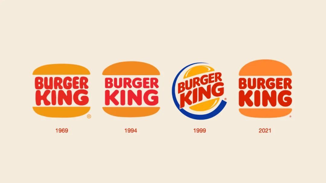
Evolution of Burger King’s Logo
Image source: JKR
Burger King had this logo many years ago. Why do you want it back now? becauseHe needs to return to his original feeling, not to follow the trend of the times.But it is undeniable that his Logo is very simple. Therefore, the most important thing is to return to the natural appearance of the brand itself, or rather, the brand’s own fashion.
Note: In other words,First of all, there is demand, and then I will find the most natural way to meet it from the brand, not to say that methodology leads me to do anything.
René: Yes, fashion is a fad. People can’t always follow the trend, because the trend will be out of date, so why follow what will be out of date?
For example, we wear clothes. If this year’s fashion is very narrow, but I am fat, should I wear this narrow style? It makes no sense. Therefore, these symbolizations and simplifications are meaningless to the brand if they are not suitable for the brand.
Note: Haha, but everyone always likes to say that we should sum up a set of successful methodology. People always hope to have a successful password.
René: What is methodology? There may be a wide range, but it is difficult to be specific to something.Brands don’t have to follow a certain style, but find the way that suits them best.
4. How is the strong design extensibility created?
Note: The case of Harbin Beer has a powerful feature: it has a lot more applications than the original vision. As you just said, maybe he made such applications in order to break the circle and cross the border. If I want such a very extensible vision now, what points should I pay attention to?
René:Today’s brands have many opportunities to reach consumers.It has not only appeared in one or two media, but also the channels are very fragmented, which is different from the design style or trend mentioned above and belongs to the change of the big environment. When we received the Brief, we considered the application of the new logo in different scenes and how to maintain a consistent brand image in these scenes-this is a very important point in our design of brand visual system, or "Brand World". Almost all VI design projects need to use a lot of information and think in many ways to discuss how to improve the whole Brand World. Therefore, from the beginning, we have thought about how to apply vision in different environments besides packaging, such as digital media and offline activities.
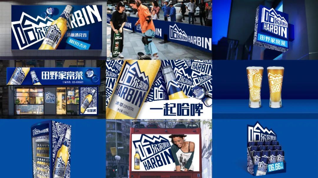
The Extended Application of Harbin Beer Brand Image
Image source: JKR
Therefore, I think there are a lot of experiences and knowledge in designing a highly malleable vision. Speaking of which, I thought of a case we did recently.
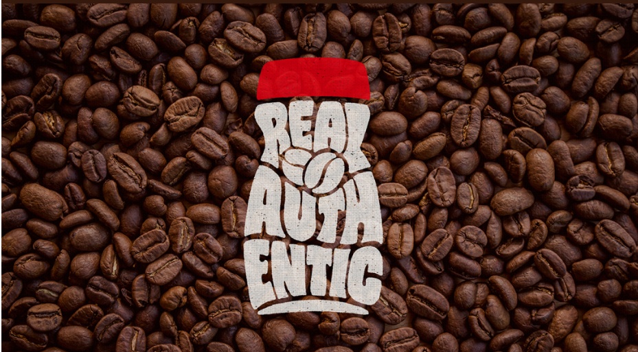
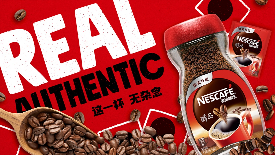
Nestle chunpin coffee
Image source: JKR
In the case of Nestle Alcoholic Products, in addition to packaging design, we should also do a whole set of visual elements. So we still use the same method to catch what the brand has done at this time and what can be built down.
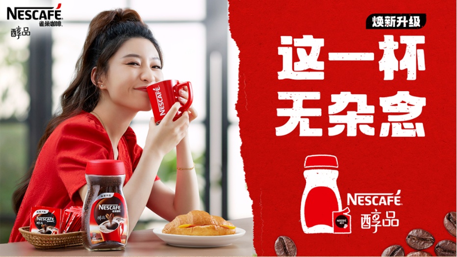
Nestle chunpin coffee
Image source: JKR
After our observation, we found that the biggest feature of alcohol is thatIts bottle shape has changed greatly, becoming more radian, rounded and lovely.It should be a very special point that we should try to grasp and establish, because this bottle type is already interesting, quite special and recognizable. This is actually an intuitive judgment that I mentioned before.
Therefore, we must make good use of this point. As a result, our entire design team has made diversified changes in this direction.
Nestle chunpin coffee
Image source: JKR
When it comes to design, it belongs to the knowledge of designers. Every color application, every text effect, every specific combination and every color expression are all the knowledge of designers and our work.
For consumers, it is enough to let them feel and realize that this is a new alcohol product at a glance. When they go to the supermarket or go shopping online, they can recognize this bottle type and identify it as the brand and product.
Set a note:The consumer may not need to be very clearly aware of which part he feels, but more likely it is a subconscious choice.
René: We all have experience. We may think that it is Nestle, which is a quality guarantee. Then I will buy it.
03
What is the real China style in the changing trend?
Note: Before, we mentioned a lot of thoughts about brand design and trends, and you also emphasized that brands should proceed from themselves and amplify their own characteristics instead of blindly following the trends.
In recent ten years, brands and designs at home and abroad have been continuously blended, and the whole has also undergone great changes. You have served many global brands in JKR, and you should have personally participated in and witnessed some changes in these ten years. At that time, foreign companies just entered the China market, maybe they had some cultural strength, but now, China brands are gradually developing in the direction of more cultural diversity.How have China brands and foreign brands changed compared with more than ten years ago in terms of brand expansion and visual design?
René: There must be some changes. Today’s world is different. Just like the case of Budweiser before, if the brand wants to integrate into the big environment of China, it must know what kind of people our consumer groups in China are.To do something to attract him, it is definitely necessary to make some adjustments and changes. It is no longer like before to force something in, and we will feel good.
We in Chinese have our own standards and aesthetic attitudes, and the era of purely learning from others has changed.We can gradually have our own style, receive foreign things, and need some adjustment to suit ourselves.
When foreign brands come in, they must understand the people here, what they like and whether the products are suitable for these people. From the design point of view, if the brand came in as it was, today, it really can’t ignore China’s own aesthetic or design needs.
Now we ordinary people have enough eyes to embrace our own brand in China, and we really want some good designs from our own country, which is what consumers expect from brands. Then as designers, we must meet such expectations.
For example, a brand "Plantag" that we have served, customers themselves have the confidence to make their own plant-based products, and also have a long-term vision to give them to us.To help it create some themes of its own,Instead of copying foreign brands that are relatively strong.
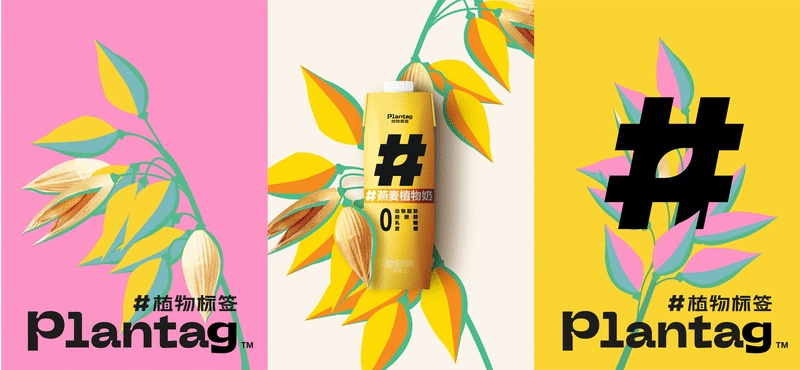
Plant label
Image source: JKR
We used the young people in China to look at natural plants, and chose richer colors.Actually, I like OATLY’s design, which is a very distinctive style in Northern Europe. The plant labels we made in China may be different from them in Chinese’s eyes, so we want to gradually establish a design language belonging to China, which is China’s own taste.
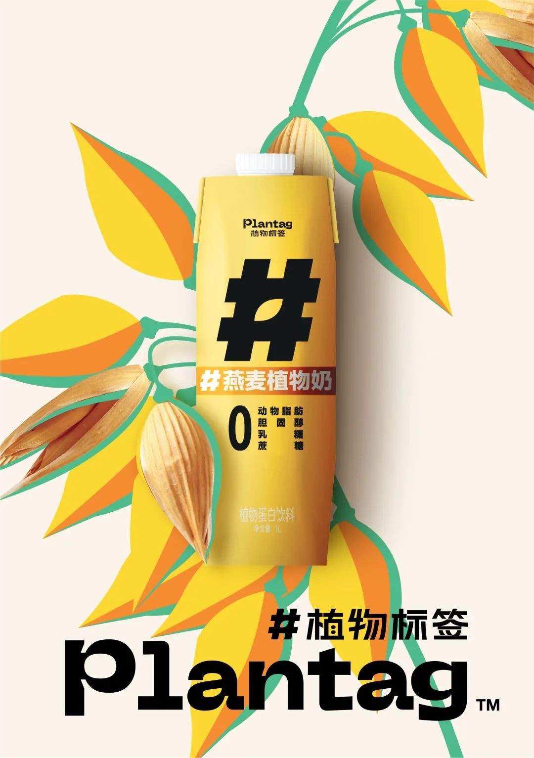
Plant label
Image source: JKR
Maybe you see something and know that this one is Japanese and that one is Nordic. I believe we will also have China’s design.In Chinese, we especially like the colorful or "rich" feeling.We don’t love simplicity in our bones like the Japanese, and the design that belongs to China needs to reflect our own cultural feelings.
Note: Yes, I think people are actually looking for one of China’s own design styles, but I just think that simply pursuing the national trend or blindly adding some elements of Chinese style can’t represent China’s design. Just as you want to see that something is a Japanese design, you don’t necessarily need to add elements such as kimono and sushi to it. It is more likely to be a feeling.
René: I think I’m beginning to look for and explore. With such a big country, we will certainly have a variety of styles, and different regions and nationalities will have their own styles. But I think I’m really beginning to look for and explore. For example, I like Li Ziqi very much. Some of his illustrations are quite interesting, and they are quite China-like and rich in feeling.
As far as my feeling is concerned, if Japan is relatively simple,Then our China may be a bright and rich feeling; But this does not mean that we must go back to the ancient times, but the new and modern ones, which will bring some collisions, but what is finally condensed belongs to us.
As a designer, you should be the first to feel such a change. There should be a lot of people who can have some perception, and then in the market, everyone can gradually see and feel it.Our market is very inclusive.As long as you can make your own brand unique, everyone will accept it.
"Design is a matter of clear knife and clear gun"
Note: Yes, the brand born here may have its own brand characteristics with China cultural characteristics. When it goes out, it may also consider the local cultures of other countries and whether it can understand these cultural characteristics. What can these brands do to keep their original brand characteristics and adapt to different cultural markets?
René: I think this is a phased issue. For example, we have some products in China now. If we want to go out now, in fact, we should try our best to keep our own brand at this stage.In the first stage, we may have to let these brands go out, and then let people see the characteristics of our China brand.No matter those words, some visual illustrations, or some iconic elements of China, we should keep them, so that outsiders can know at a glance, oh, this is a brand like China, instead of leaving an unclear and vague impression.
Because at this stage, if you quickly adjust to the local culture, people will not know who it is when they see it, or they will only know when they pick it up. It is Asian, so where in Asia, China, South Korea or Japan? This first impression is very important.
Design is an obvious thing, and I am most afraid of ambiguity and thinking about the past.Our consumers’ acceptance ability is very high. I hope our customers can be bold, and the most important thing is to return to themselves and their own products, and make their own characteristics.
In the future, after the brand image has been established, according to some changes in the times and trends, or according to some local cultures, it will not affect the established brand foundation. Of course, not to follow, the most important thing is to see if it is suitable for your brand.
04
[Design] column introduction
"Design Notes" is a column of www.foodtalks.cn. We are committed to recording designers’ design experience, exploring and sharing more "treasure" design institutions, hoping to build a bridge for further understanding between brands and designs!
For case recommendation, please contact the author of this article, Chain (WeChat: simba_events).
(Please note: Intention-Name-Company-Job)
05
[FoodTalks global food packaging group]
Want to find design inspiration? Want to know the latest food packaging trends? Want to talk and laugh with the big coffee in the industry? Contact Damon (WeChat: fbifbdaa) to join the global food group!

(Please note: Intention-Name-Company-Job)
Tip:
* This article is the original launch of FBIF, welcome to forward it to friends circle unconditionally. Reprint please reply "Reprint" in the background to understand the rules.
* FBIF submission and business cooperation, contact Jojo (WeChat: fbifmediayes)
More articles
/FBIF food wechat group/
Let professionals get together, 15w+ food people have joined!
This article first appeared on WeChat WeChat official account: FBIF Food and Beverage Innovation. The content of the article belongs to the author’s personal opinion and does not represent Hexun.com’s position. Investors should operate accordingly, at their own risk.